Table of Contents
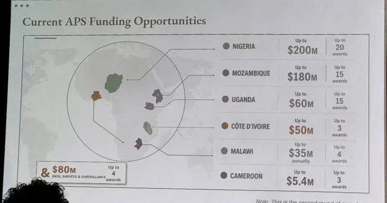
During a formal presentation, officials meant to show a map of six countries currently receiving American health funding. Instead, they displayed an AI-generated map that was wrong in literally every labeled detail.
Here is why people are absolutely furious about it:
1. They completely rearranged the continent.
The six countries highlighted were Nigeria, Mozambique, Uganda, Ivory Coast, Malawi, and Cameroon. Not a single one of them was correctly identified on the map.
- Nigeria was shown as a landlocked country deep in the Sahara Desert, completely ignoring its actual location on West Africa's Atlantic coast.
- Mozambique was somehow dragged all the way from southeastern Africa up to the Horn of Africa.
- Ivory Coast was placed on the exact opposite side of the continent from where it actually is.
2. They did this right in front of the people they were insulting.
This wasn't a private meeting. The room was filled with senior African government officials, including the director-general of Nigeria's national health agency. The presentation was led by Jeff Graham, the senior U.S. health envoy heading PEPFAR, which distributes billions of dollars for HIV treatment across Africa.
3. The internet caught the AI watermark immediately.
Attendees immediately filmed the slide, and once it hit the internet, observers quickly spotted an almost invincible artificial intelligence watermark linking the image to OpenAI's tools.
4. The State Department used the ultimate "dog ate my homework" excuse.
After the backlash, the State Department confirmed the map was AI-generated. They blamed a team member for hastily altering the slide deck at the very last minute before the presentation. Former officials have noted this blunder follows a Trump administration decision to cut experienced State Department staff and replace them with junior employees working with less supervision.
5. It highlights a much darker structural problem.
The map error is bad, but the implications are terrifying. For decades, the United States has been the primary source for health data, poverty statistics, and disease estimates about Africa. These are the numbers that determine where global funding goes and how African governments plan for the future.
If the institution handing out billions of dollars in health funding can't even correctly locate these six countries on a map, how can anyone trust the underlying data driving those programs?As analysts have warned for years, a lot of what the world "knows" about African poverty and disease comes from institutions that treat the continent as a subject, not a partner.